CSS制作流光按钮
AlightYoung 10/28/2020 CSS
# 源码
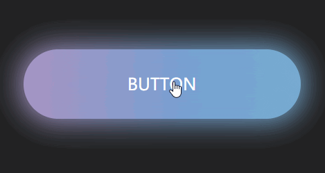
昨天看到个非常花里胡哨的按钮效果,记录一下
<!DOCTYPE html>
<html lang="en">

<head>
    <meta charset="UTF-8">
    <meta name="viewport" content="width=device-width, initial-scale=1.0">
    <title>Document</title>
    <style>
        * {
            margin: 0;
            padding: 0;
            box-sizing: border-box;
        }

        body {
            width: 100vw;
            height: 100vh;
            display: flex;
            justify-content: center;
            align-items: center;
            background-color: #222;
        }

        a {
            text-transform: uppercase;
            width: 400px;
            height: 100px;
            text-decoration: none;
            font-size: 24px;
            color: white;
            text-align: center;
            line-height: 100px;
            position: relative;
            border-radius: 50px;
            background-image: linear-gradient(to right, #77A1D3, #79CBCA, #E684AE, #77A1D3);
            background-size: 400%;
            z-index: 1;
        }

        a:hover {
            animation: streamer 4s infinite linear;
        }

        a::before {
            content: '';
            position: absolute;
            top: -5px;
            bottom: -5px;
            left: -5px;
            right: -5px;
            border-radius: 50px;
            /** half of height, the same as button */
            background-image: linear-gradient(to right, #77A1D3, #79CBCA, #E684AE, #77A1D3);
            background-size: 400%;
            z-index: -1;
            filter: blur(20px);
        }

        a:hover::before {
            animation: streamer 4s infinite linear;
        }

        @keyframes streamer {
            100% {
                background-position: -400% 0;
            }
        }
    </style>
</head>

<body>
    <a href="#">button</a>
</body>

</html>
1
2
3
4
5
6
7
8
9
10
11
12
13
14
15
16
17
18
19
20
21
22
23
24
25
26
27
28
29
30
31
32
33
34
35
36
37
38
39
40
41
42
43
44
45
46
47
48
49
50
51
52
53
54
55
56
57
58
59
60
61
62
63
64
65
66
67
68
69
70
71
72
73
74
75
2
3
4
5
6
7
8
9
10
11
12
13
14
15
16
17
18
19
20
21
22
23
24
25
26
27
28
29
30
31
32
33
34
35
36
37
38
39
40
41
42
43
44
45
46
47
48
49
50
51
52
53
54
55
56
57
58
59
60
61
62
63
64
65
66
67
68
69
70
71
72
73
74
75
效果如下